Artist Talk: SOHEILA SOKHANVARI

Soheila Sokhanvari is an Iranian-born artist. Sokhanvari first studied an gained a degree in Biochemistry before completing a second degree in Fine Art, and started her presentation with an image of her final piece at Goldsmith University. It consisted of a taxidermy pony upon a blue round object made of fibreglass. She did not going to depth about the meaning of this piece although gave the pieces name ‘The Green Movement’ – upon researching this i found that this piece was a part of her exploration of magical-realism as well as acting as a political piece, as it the refers to the 2009 Iranian movement where protesters demanded the removal of Mahmoud Ahmadinejad from office, during the presidential election.

the green movement

Soheila Sokhanvari, 2011,
Taxidermy, Fibreglass, Jesmonite blob, automobile paint, 170 x 230 x 140 cm

She explained how her pieces explore trauma, reflecting upon her own exile from Iran. She explores this through different methods. One method being drawing from an image, (she uses photographs of her family) and then drawing from the first drawing, and repeating this process until she decides the piece is satisfactory to her. Upon asking how she knows this point she put it down to her intuition. After questioning it also arose that this method reflects the distortion that occurs through memory. These drawings are created using crude oil as a form of physical connection to the political importance of crude oil in Iran.

paradise lost

Soheila Sokhanvari, Paradise Lost

Another method of exploring her trauma results in creating art from the negative spaces found in her family photos. She uses this negative space to create a positive self-representation of her own form – placing herself in the picture.

touching-the-voidself-portrait

Soheila Sokhanvari, Self-Portait

This sculpture ‘Self-portrait’ was created in reaction to her previous drawing, which was created from the negative space of a photograph. She created it as a way to create a physical presence, forming a positively spaced piece.

Sokhanvari also continues to create a series of work with passports. She takes old passports and reinvents and parodies them with ironic stamps relative to the passport owners gender, ethnicity and other identifying factors. She has presented these passports in clear frames so both the covers and the photo pages can be seen.

passportspassports 2

I found this the most interesting artist talk of the year so far, due to Sokhanvari’s clear explanations on what drives and inspires her artwork. I also was really intrigued by her use of the negative and how she created a physically positive piece from it.


Artist Statement

My artwork consists of four, framed, cartoon animal portraits, and a collection of butcher-shop illustrations and photocopies. The portraits are of a horse and pug in black, a pig in pink and a cow in orange felt tip, while the original butcher-shop illustrations are watercolour with black fine-liner. I decided to photocopy my originals to create the idea of mass production, reflecting the food industry.

My artwork aims to challenge the perception of which animals are pets and which are food. I began using pen, due to its accuracy and quickness, when first wanting to place stereotypical pets in the positions of animals regarded as food. When picturing the meat industry, I envisaged a butchers and recalled diagrams of animal-meat charts. After sketching meat-chart designs for dogs against cows, I wanted to explore another medium and so experimented with watercolour. I chose watercolour having associated it with the delicate, illustrative style I had seen of animal diagrams before, and how they make a gruesome concept appear appealing. I chose to outline, and detail with black fine-liner, as I felt this combination enhanced the illustrative style I was aiming to create.

I researched and created a presentation on Raymond Pettibon, who’s artwork influenced my portraits. I liked his use of black ink as I felt it aided his comic-like, satirical style, due to its simplicity. I was also interested in his use of ambiguous text and juxtaposition, as I found they greatly involved the audience, as their ambiguity raised more questions than answers, which is a key aim for my own work. I chose to create a portrait of a pug, due to its popularity as a pet, depicting it in black pen. I wanted to juxtapose this against a pig, due to the similarity in name and physical form. I used bright pink to illustrate the pig, so it would appear stereotypically ‘cuter’ and I continued this idea with the cow, juxtaposing it with a horse, drawn in black. The cartoon-like style was also chosen due to my experience of farm animals illustrated in children’s books and found in commercial home décor. I chose these particular animals due to their equal physical forms but completely unequal places in the British food industry. I wanted to push this juxtaposition further and so researched cultures with contrasting food views. Influenced by Pettibon’s use of language, I wrote ‘friend’ in Hindi and Persian on the cow and pig, and ‘food’ in Chinese and French on the pug and horse. I also have titled these works, such as ‘Chinese Food’ and ‘Hindi Friend’. This highlighting of cultures aims to question human perceptive upon which animals should or shouldn’t be eaten, powered by my own vegetarian view that animals are all equal.

I want to exhibit the framed pieces as though part of home décor and surround the following adjacent space with the butcher-shop illustrations to juxtapose this cute imagery against the normalisation of animal slaughter. After consulting my tutor, I next want to explore advertising techniques by again placing pets in the positions of food.


Continued plans for exhibition…

By my exhibition I will also have a dog-meat chart and copies, I plan to explore text alongside them, possibly adding in recipes but changing the meat to dog.

After speaking with my tutor, i have decided that to continue my work i want to look into  the old industries advertising, subverting the norm and replacing typical food animals with stereotypical pets, to increase the gore and show the treatment of ‘food animals’.

dog-meat chart

Dog-meat chart, watercolour and pen, A3

Cartoon Animals

These four portraits came from me returning to my use of pen, and wanting to portray the other commonly seen images of animals. Those of home decor or children’s books.

chinese food

Chinese Food, black pen, A4

persian friends

Persian Friends, pink and black pen, A4

French food

French Food, black pen, A4

hindi friends

Hindi Friends, orange and black pen, A4

I also chose to frame these pieces to add to the home decor feel, as though these animals were pets.

frames

Framed above 

I felt that the cartoon animals were enhanced when in a frame, but felt that the ‘Cow-meat chart’ belonged as more of a poster, like using its original purpose against it as a protest piece. This also gave me the idea of photocopying it.

Watercolour Butchershop

I thought of the meat industry thought of the raw display of animals in butcher shops, and how normalised it is, and how atrocious it would be if the animals were animals we typically viewed as pets.

toby carvery

Meat chart found at local toby carvery

I found it interesting how this illustration was included in the decor, and how normalised it was considering what a reminder it would be of the animal slaughtered and eaten, and this further made me want to put a dog in this same position, to see the reaction.

watercolour cow-meat chart

Cow-meat chart, watercolour and black pen, A3

I then created my own version of a cow meat chart to have beside a dog, to act as a juxtaposition and raise the question why we may be okay with eating one animal and not the other. I felt watercolour was a delicate, pretty medium and would go along with the idea that certain animal slaughter has been normalised.

Sketchbook continued

After the other drawings, i wanted to look a little more into the social media presentation of animals as another perspective. I started my research by scrolling through instagam and noticing the ‘dog’ accounts ran by owners, and the fame that these pets received, whilst at the same time other animals were being shown through recipes for burger, etc…

pig ig

Insta-famous pig vs Lemongrass dog, coloured pen, A5 

I decided to subvert this presentation i had noticed on social media, by showing a pig as a ‘famous pet’ and underneath having a recipe, from Korea, for a dog curry. I felt this subverting would force the audience to question why many people are comfortable with seeing ‘pork curry’, but many (western) audiences would be outraged by a ‘dog curry’. I also wanted to make sure the recipe was a real recipe to present cultures different perspectives on animals that are friends or food.

This was originally left as as an outlining piece with black pen. However after coming back to it i felt the impact and ‘aesthetic’ nature of social media, especially instagam, was lost if it remained monochrome. I wanted to add to this perfect photography that is associated with Instagram and so continues filling in the details with pen, to create a cartoon feel, similar to pop art. I also want to continue the use of text, such as Pettibon uses, to enhance the narrative of the piece.

Sketchbook

At the moment I am experimenting with the form I want to convey my ideas with. I am currently starting in pen in my sketchbook, just to quickly get my ideas down on paper before i start painting.

Cow sketch

Taste: Cow-Meat Chart, Black pen, A5 

Dog sketch

Affection: dog-meat chart, black pen, A5

I created these two pieces with the simple idea of presenting the cow and the dog in identical ways. The meat diagram for the cow is more common to see across the world, however the meat diagram for a dog is less common, i found this version for a Chinese butchers. Instead of filling the sections with their meat cuts, i decided to fill them with words associated with the animal, focusing the food and taste adjectives for the cow and the pet adjectives for the dog, to highlight the perceptive difference between animals that are food and animals that are friends.

I want to continue these designs into paintings, also i feel that potentially swapping the words would create a more questioning piece. Especially with a few more contrasting animals like pigs and cats.

I decided upon using sharpies for this with simple black line after looking at Raymond Pettibon’s work, as i feel his work conveys the narrative in a simple way uncomplicated by lots of colours or content.

Tate Modern Visit

tate modern.jpg

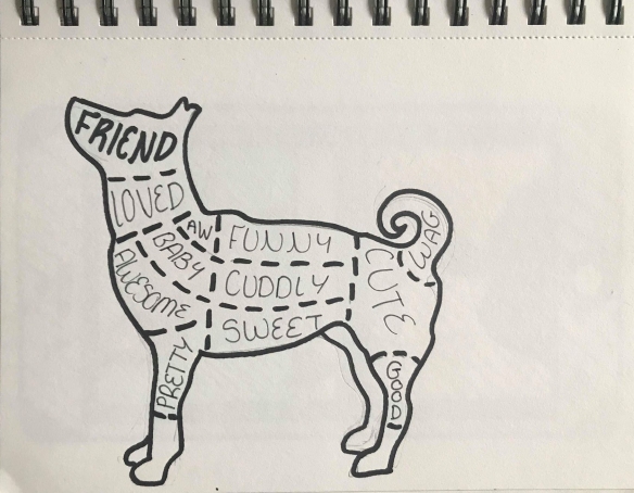
During my week 6, I wanted to go and explore a gallery, to gain inspiration and explore different artists, as well as physically viewing art pieces, as opposed to the usual way of online and through photography. I felt that seeing these pieces in flesh would add another level to their impact upon me.

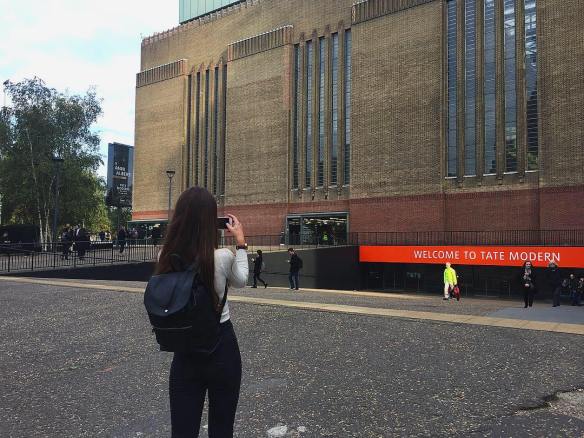
I had never visited the Tate Modern in London before, and this is why i chose it as my galley to visit for week 6. On first sight the building felt huge and overwhelming, due to its intimidating scale and stature, a well as it consisting of two buildings: the Natalie Bell and the Blavatnik; as well as the turbine hall. The interior of the Tate is monochrome, with the Natalie Bell maintaining black and white, and the Blavatnik white, both with wooden flooring. The interior of the building reflects the contemporary minimalist idea of the white room, to make clear what is art and what is apart of the galleries structure, considering now contemporary art can be anything, as ordinary as a bench.

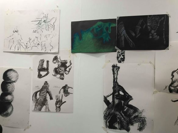
As I entered the first Tate Modern exhibition I quickly found myself drawn to certain pieces and photographing them, partly for documentation and also out of my own pure interest. I felt that i should carry on this photo and document the pieces that drew my attention the most and explore why this was.

tate6.1tate6

tate6.2

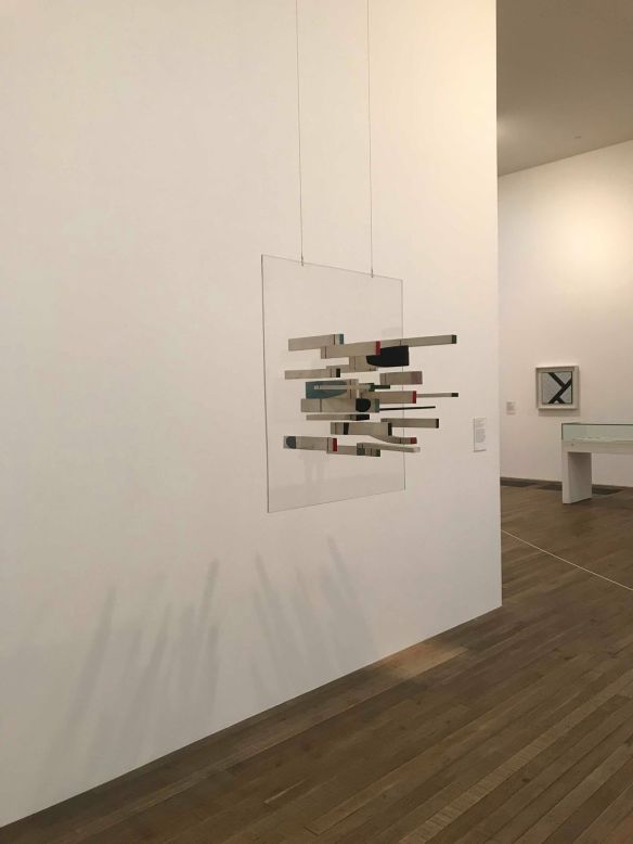
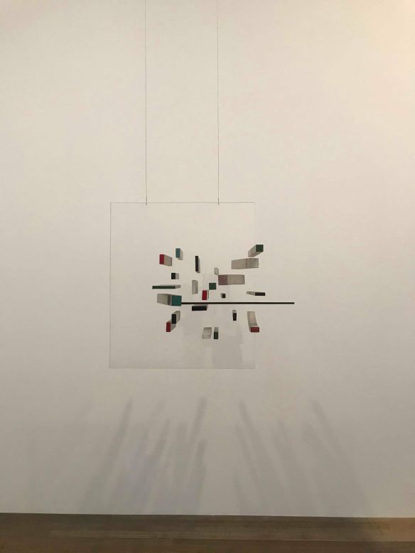
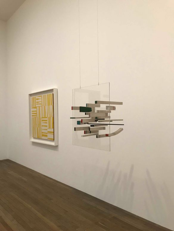
Victor Passmore, ‘Abstract in White, Green, Black, Blue, Grey and Pink’, 1963, Perspex and painted wood

This first piece struck me, because of the way it cast shadow. I found it the most interesting part of the sculpture, as i wondered if it would have been the artist’s intention for it cast a shadow in this way, or if it was a result of the curators positioning. I also found myself interested in it because of its abstract nature, which is unusual for myself since usually i would find myself veering away from the abstract and towards the figurative. I think it was the way the wooden blocks seemed to float in the clear perspex as the sculpture is suspended from the floor, combined with the accents of different colours on the ends of the blocks.

tate5

tate4

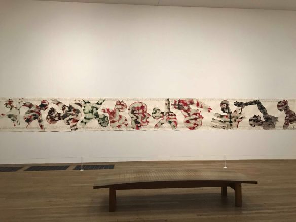
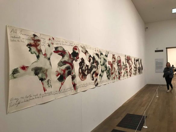
Barthelemy Toguo, ‘Purification’, 2012, Watercolour and graphite on paper


When walking into this room this piece was the first thing you could see from any of the entrances. I was intrigues by its scale mostly, due to its long banner like appearance and the fact in order to read the text on it you would have to walk up and down the piece and i found that this captivated me and i felt like I was actively reacting to it physically. At first I was drawn to the banner because it reminded me of first year, where long stretches of paper were pinned to the wall and as a year we created a piece together. Also I liked the figurative and abstracted qualities combined, with the colours and the (what i thought were dancing) figures. Upon reading the text it took me a while to realise it was regarding human rights and I felt after reading this information, the use of a banner like surface to paint on made sense. As though it was a protest sign.

tate9

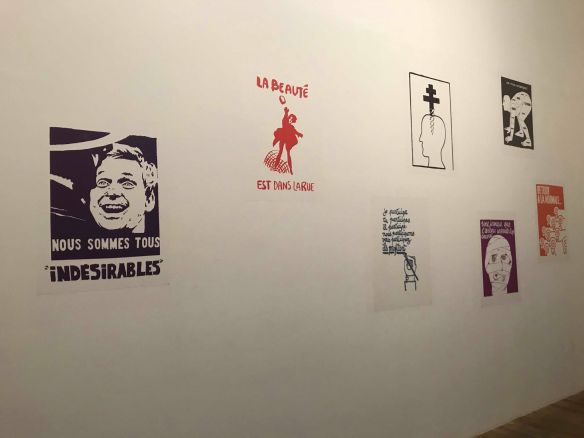
L’Atelier Populaire de Paris, 1968tate9.1

tate10

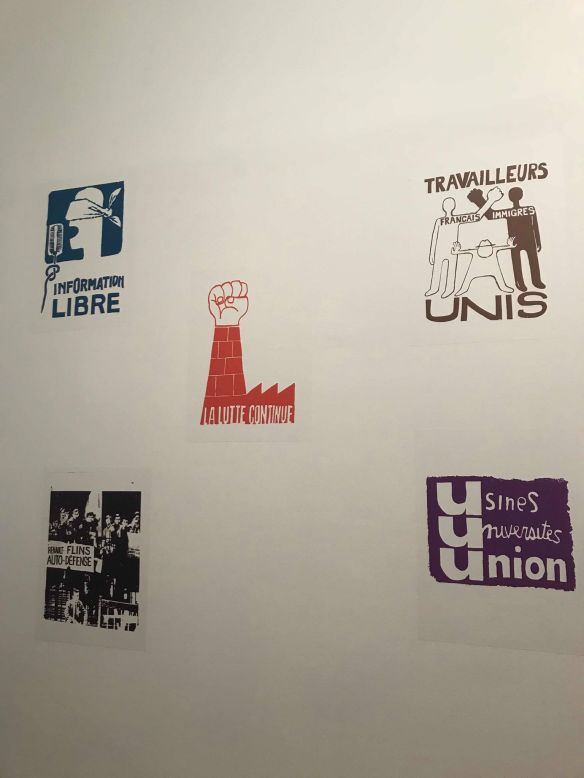
‘Do women have to be naked to get into the Met. Museum’, 1989, and ‘What do these artists have in common?’, 1985

tate15

Guerrilla Girls, 1985


I was extremely excited when i came across these pieces of work, since last year i had looked into them and produced my own poster in reaction to their method of printing. It was amazing in person, and it enhanced the thought i’d had previously that seeing work in the flesh adds another level to the experience of viewing them. I found it interesting that the L’Atelier populaire’s work were in their original form as posters stuck to the wall whereas the Guerrilla Girls’ work was framed, and this highlighted the fact that L’Atelier populaire’s work weren’t made for galleries whereas the Guerrilla Girls’ work were, and this hadn’t occurred, and probably wouldn’t have, to me, before viewing them physically.

tate8

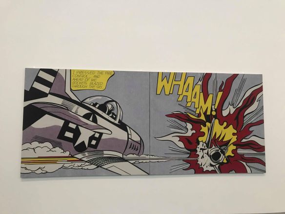
Roy Lichtenstein, ‘Whaam!’, 1963, Acrylic oaint and oil paint on canvas

tate11

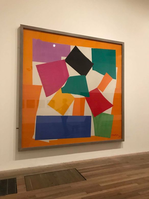
Henri Matisse, ‘The Snail’, 1953, Gouache on paper, cut and pasted on paper mounted on canvas

tate13

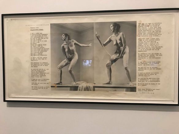
Carolee Shneeman, ‘Interior Scroll’, Beet juice, urine and coffee on screen print on paper

tate14tate14.1

Furthermore seeing these pieces in flesh, which I have studied and drawn from over many years, made me realise how little a photo can project and that seeing pieces physically creates a far more engaging experience.

The Jenny Holzer exhibition, was one that I found the most interesting. The thing that really stood out for me was the text. As i study both art and literature, i love to see it combined, and so these pieces were inspirational to me in how i can combine my courses. I found her different mediums really interesting from posters, to marble benches, and to LED pieces, that all together contained or presented meaningful and interesting text. My favourite piece from her show was the ‘Blue purple tilt’, due to the way the words travelled up the pieces as though they were travelling out when reaching the top. As well as the neon nature of the light adding another interesting quality.

LED Jenny

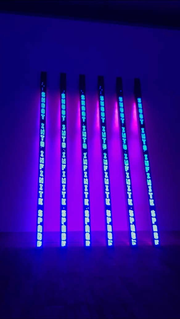
Jenny Holzer, ‘Blue Purple Tilt’, 2007, 6 light emitting diode columns

Overall following my trip to the Tate Modern Museum I feel I have been inspired to visit more exhibitions, as i have realised how important and what a difference it makes to experience pieces in person, when possible. Also i want to explore more work by Jenny Holzer, as to how she uses texts to create a universal message for people who may not enjoy art, but at least can still read.

Drawing from Sculpture workshop

I decided to participate in the drawing from sculpture workshop to work my observational drawing.

workshop1

The exhibition room was full of clay sculptures created by other students participating in the clay workshop. We began the session with white, A2 paper and charcoal. We were instructed to focus on tonal drawing, and were given 5 minutes to draw from a section of the sculptures. I decided upon a face i could see within the work. However when the 5 minutes were up i realised id been too dainty and the piece was tiny in comparison to the paper. This was noticed as a while, and we were encouraged to work outwards from the middle of the piece rather than creating boundaries at the beginning, as i had, and this would allow us to fill more of the space. We were given a further 10 minutes to do this and i focused upon a large shape with an outstretched hand at the top. I felt this piece was much more successful as i filled the paper quickly, and by staring with a medium tone, i could use a mixture of my rubber and charcoal to add highlights and shadows.

After this the lights were turned off and multi coloured spotlights were shone onto the sculptures at different angles. I found this difficult at first because i found working on white paper meant I had a lot of darkness to add into it and the effect of highlight, created by the spotlights were lost. We were then offered coloured/white chalks/pencils to use on black A3 paper. This was a new experience for me and i found that this new method of almost working backwards, by adding in the brightest tones and shading into the darkness of the paper really interesting. We continued for a while of drawing and I chose to draw different sections all on one piece of paper to replicate the way the individual sculptures were all linked together to make the larger work.

After this a scanner was used to go over the sculptures and the results were projected onto a back wall. I found this really interesting as I had been sat at a distance from the pieces and this gave an up close look at the work.

Overall I found the most interesting part, the moment we were placed in darkness. I found it really enhanced my perception of tone and helped me to focus upon this rather than just shape. Also using black paper and white pencil to work on the highlights, rather than white paper and black charcoal focusing on adding shadow, was really eye opening to how I would like to further create monochrome drawings in the future.

workshop2